Branding Jazz
I was hanging out at Jazz at Lincoln Center the other day, checking out Wynton Marsalis Septet. The music was—of course—pretty spectacular, but I was really struck by the brand identity and literature.1
Well, now I know why: the branding was done by Paula Scher at Pentagram. The brand identity was developed in 2004, and refreshed in 2010.
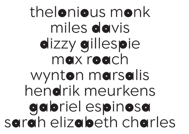
There are lots of photos in this article about the refresh on the Pentagram blog. I like the typeface which is based on Neutraface 2, although the filled in letters can get intense. The print pieces were done in-house at Jazz at Lincoln Center and look fantastic. Quality photography helps too.
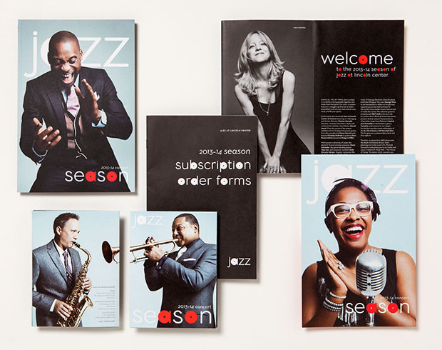
What’s really interesting is the choice to remove “at lincoln center” from the logo. From the Pentagram blog post:
Now that Jazz is recognized as a major cultural institution in its own right, the update clears away the “at Lincoln Center” and leaves the organization as exactly what it is: Jazz…
“We had hoped that the organization would eventually ‘own’ Jazz and that any other explanation of the place would become unnecessary,” says Scher. “The new identity formalizes this arrangement, which was the original intent.”
Uh, yeah. I’ve never heard anyone at JALC refer to it as just “Jazz” (like, “Welcome to Jazz. It’s gonna be a great set!”) so I’ll assume they don’t. Because to say that JALC simply is Jazz would be fucking weird, if not sinister. “What is Jazz?” is one of my least favorite conversation topics in the world, so I’ll leave it at that.
-
The website is nice too—much better than most Jazz sites—but a little cluttered and confusing. I like the pairing of Brandon Grotesque and Freight Text Pro. ↩