Two principles for making better websites
Given that most musicians don’t have the budget for a professional website but also can’t be expected to spend years learning the craft of web design, I’d like to offer a couple of important principles for making better websites, and a quick example of how they can be applied.
If you’re making your own website or even using a service like Squarespace or WordPress as I suggested prevously, I strongly encourage you to keep these suggestions in mind.
How much time you got?
If you only have five seconds, here’s what I want you to take away from this:
- Choose readable color combinations for the text and background.
- Make the text bigger.
If you have five minutes, read the rest of this article. If you have fifteen minutes, read the rest of this article and then read Typography in ten minutes.
Think about visual contrast
One of the most common issues I see with music websites is poor contrast, especially in combinations of text and background colors.
There’s a good reason why so many websites—and printed material like books and newspapers—use black text on a white background. That reason is contrast.
Start with black text on a white background and go from there. Don’t sacrifice your users’ reading experience to feel clever or creative. That means no black on red, no purple on black, and definitely no light grey on dark grey.
Visual contrast applies to more than color. If you’re interested, check out Contrast and Meaning, a great article by Andy Rutledge.
Think about typography
Another common issue with music websites—well, websites in general—is text that’s just too damn small. A good rule of thumb for the web is to make body text at least 16px.
The next things to think about after font size are line spacing, and line length.
Here are the relevant parts of Typography in ten minutes from the amazing Practical Typography book:
point size is the size of the letters. In print, the most comfortable range for body text is 10–12 point. On the web, the range is 15–25 pixels. Not every font appears equally large at a given point size, so be prepared to adjust as necessary.
line spacing is the vertical distance between lines. It should be 120–145% of the point size. In word processors, use the “Exact” line-spacing option to achieve this. The default single-line option is too tight; the 1½-line option is too loose. In CSS, use line-height.
line length is the horizontal width of the text block. Line length should be an average of 45–90 characters per line (use your word-count function) or 2–3 lowercase alphabets…
A quick example
Here’s an example from the schedule for Smalls Jazz Club. It’s not great.

Black text on a dark background makes for poor readability, especially as you get further to the right where the instruments are listed. I have to strain my eyes to read it. The background image itself is cheesy and makes the website look dated, but I’ll let it live for this exercise.
The typeface is Courier. It looks a lot like a typewriter font, and that’s because it is. A strange choice for a Jazz club, especially one as hip as Smalls. The size is acceptable, but could be a little bigger for my taste.
Three of the four musicians’ names are bold; it looks like Dena DeRose is less important than the others. Evidently, the bold names are just links—Dena DeRose doesn’t have a bio page on the Smalls website, so she doesn’t get a link.
Five minutes later…
Keeping the principles of contrast and typography in mind, I spent less than five minutes with this little chunk of the internet and made some improvements. I didn’t touch the content itself, only the presentation.
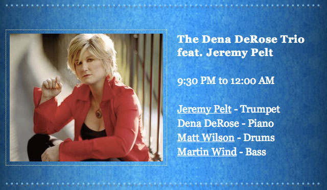
Here’s what I did:
- Changed the text color to white for better contrast.
- Changed the font to Georgia—a very uninteresting choice, but better than Courier.
- Made the text bigger.
- Made the headline bold instead of bold and italic, which is generally a bad idea. I also added a little bit of space between the letters (using the CSS letter-spacing property) to give the letters some breathing room.
- Made links underlined instead of bold.
It still isn’t great, but it’s not bad for a couple of minutes. I no longer have to lean in and strain my eyes see who’s playing tonight. Imagine what we could do given more time and a blank slate.
I urge you to design for your users and think about visual contrast and good typography.